Movies with Mikey
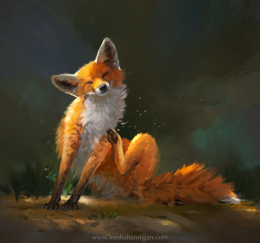
Little fox
There was a super cute fox in the garden that day, and he was very happy having some scritches in the sunshine. So I sketched him!
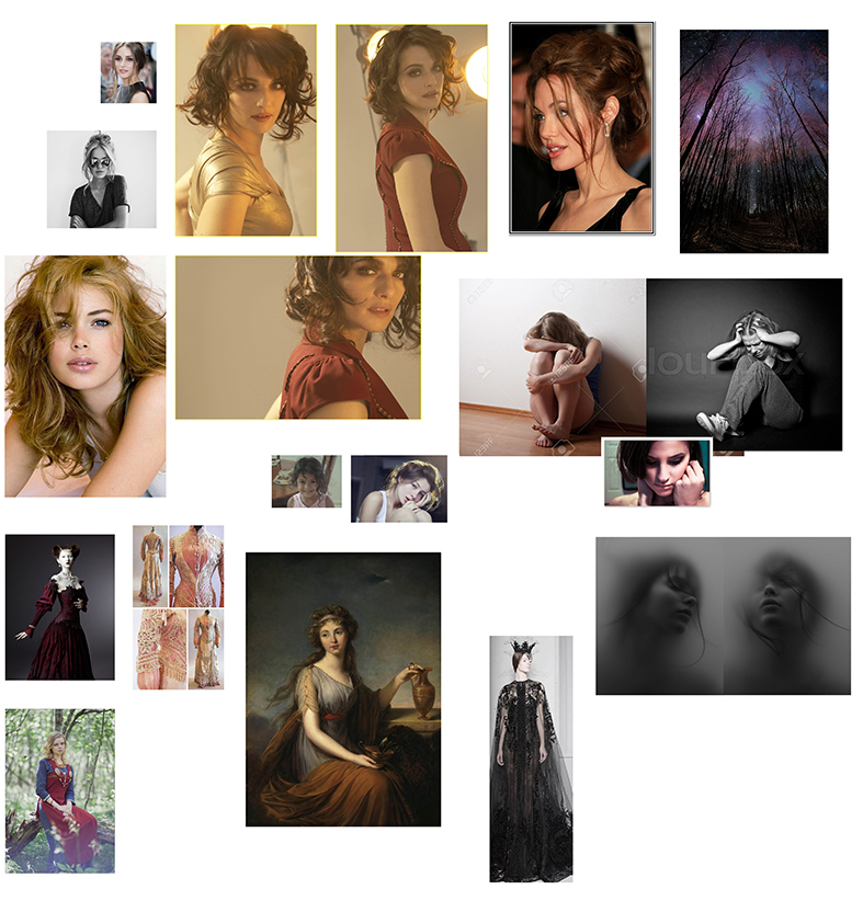
Skin tone studies
Some skin tone studies, from reference. I'll be putting aside time for these studies between client work this month.
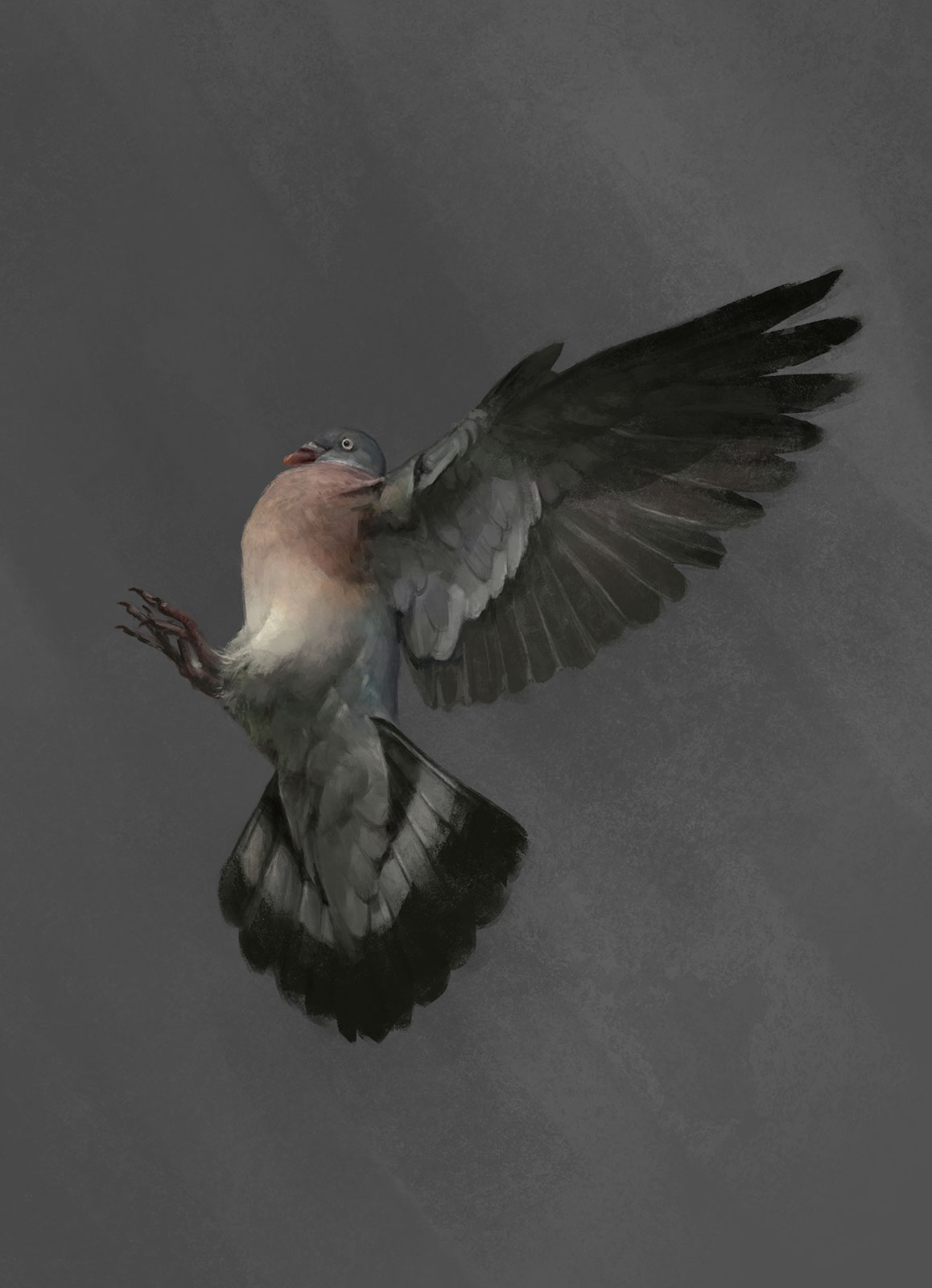
Dove and Wood Pigeon studies
Cloud studies
Paw studies
Wolf Thumbnails (featuring cute wolf cubs!)
Some colour thumbs and a quick wolf study to prepare me for a new painting. :)
The title will be "Pack Mother", so I'll be trying to include some wolf cubs in there somewhere. Yes, it will be cute.
Livestreaming on Twitch Creative!
I thought I'd try to livestream some stuff once a week, to help me focus :)
If you'd like to follow me, here's my Twitch Channel: https://www.twitch.tv/leeshahannigan
This little fawn was the study I did for my first stream!
Horse Study
I thought I'd do a nice comfort-zone animal study the other night, so I chose a lovely shiny black horse to paint.
I also made a little process gif!
All the cards I did for Paladins!
I had a great time working with Hi-Rez Studios on these! Hopefully you will get to see a few of them in game. :)
Popped Culture!
I was asked to contribute a piece to Dan Luvisi's 'Popped Culture' book that will be coming out soon!
"Bow-Wow Goes to the Park"
Two more cards for Paladins!
Left: 'Survival Instincts'
Right: 'Well Rested'
These were a lot of fun to do. :)
I love squirrels
So I painted one.
Process for 'Song of Madness'
Hello everyone!
I thought you might like to see a process gif I put together for 'Song of Madness' :)
Here's some reference/inspiration for the piece, and a couple of sketches that I ditched in lieu of a more intimate angle (though I still like the ideas and may use them later on for something else):
The challenge here was communicating the impact of sound using visuals only. The figure is clutching her head/ears in both preliminary sketches, in the left sketch the world, along with the victim, is basically falling apart - descending into chaos/madness. In the right there are spell particles and a flock of frightened bats taking flight in response to the noise. Flying debris would be present in both.
I ended up ditching these ideas, choosing a more close-up perspective (to perhaps enhance the feeling of claustrophobia or inescapability) and painting the spell aggressively whirling around the subject in the form of purple wisps with screaming little skulls.
It was a fun exercise, and definitely got me thinking about how to illustrate a non-visual concept.
And the finished painting:
Thanks for reading!
Animal Crossing
A commission I just finished up for a lovely Animal Crossing fan. :)
'The Last Matriarch' process, or 'How I Use Reference'
Hi guys!
I have been asked quite a bit recently to make a process post, specifically to outline the way I use reference in both my studies and finished paintings - so I thought I would put together all the 'steps' I generally go through when I create a painting.
I feel like I should add a disclaimer here: I am not the most methodical person in the world, and that probably shows. I 'feel things out' quite a lot, I often do pages and pages of thumbnails which I end up completely ignoring, and I'm very flighty with my sketches - but there is one thing I always do when I'm painting a new thing, and that is use reference.
So let's have a look at some of my first sketches for 'The Last Matriarch'. As sketches always do, these began with an idea.
The idea was, I suppose, to explore mythical beasts in a naturalistic setting. In this case; a depiction of motherhood, or rather, anticipation of motherhood. I see hundreds of paintings featuring rampaging fantastical beasts bearing down on warriors and soldiers, breathing fire and what have you, but I don't see that many paintings depicting what all of these creatures do in their own time. I guess I kind of find it refreshing to try and look at things from another angle.
So, the two sketches above are obviously quite different. Similar muted colour palette (which was also a goal here; to explore a colour palette I was unfamiliar with) but a very different perspective. I ended up choosing the bottom sketch to work with, because I wanted to promote that feeling of an intimate moment, and additionally emphasise the scale of the dragon by way of a cropped view, implying a more 'cramped' setting than the sketch above.
I also enlarged the canvas a bit more, as I felt the elements needed much more room to breathe.
So, cool, I had what felt like a pretty solid direction. That meant it was time to do studies.
I know a lot of people think studies are boring, but there is absolutely no way you will successfully paint something if you don't know what it looks like first. The reason studies are so ridiculously important is because they will add information to your visual memory bank. I know it sounds super fun to be able to magically paint something perfectly from your imagination - but there's seriously no way around this. Do your studies, and do them often! :)
Below are two examples of the types of studies I will generally do before I start on a creature painting. We technically haven't got the faintest idea of what an animal looks like that doesn't exist (unless you're like me and think that dragons totally do exist, and they're just hiding... like Pokémon), so what I do is study animals with features I can use for my mythical creature.
In the case of dragons, that's snakes, turtles, pangolins, lizards, frogs, crocodiles and alligators, and studying scientific drawings of dinosaurs helps too. If you get really lost, I also highly recommend checking out Todd Lockwood's work - he's kind of an authority on this stuff.
For reference images, aside from Google Image search, I highly recommend Pinterest - it's surprisingly helpful, and you can always make your own Pinterest boards to store reference images instead of clogging up your hard drive. A couple of others I like are flickrhivemind.net and the 'earthporn' subreddit.
The dragon wasn't the only thing I wasn't 100% sure how to render in this sketch. I've never painted piles of gold treasure before. I'm sure I could wing it, but it would have probably looked completely terrible. So, I also did some quick gold studies to get my head around it a little first.
Taking the time to do those studies amounted to only a couple of hours or so. And taking a couple hours to avoid dozens of wasted hours painting and re-painting something you don't understand, is seriously well worth your energy. I felt much more confident about the materials I'd be rendering, so I moved ahead with my sketch. But before I show you all of that, I want to firstly show you how I use reference along the way.
While I am painting, I generally keep at least one reference board or 'moodboard' open, floating in another window in Photoshop. (For those who might not know how to do this, go to Window -> Arrange -> and choose 2-Up Horizonal or Vertical). Or better yet, have them open on another monitor.
Below are the two reference boards I created for this painting - you can probably see which objects inspired a lot of the elements in the final!
Here is my mood/inspiration board and dragon reference. To the left are paintings that inspired my colour palette and the overall tone of the painting. You can see an image of Smaug from The Hobbit. There's a kitten, for some reason. You can see works by Edwin Landseer and Louise Élisabeth Vigée Le Brun - two of my personal favourites. They use a lot of gorgeous, subtle colours and soft lighting to create a rather moody and muted colour palette. There are also some images of labradorite - a crystal that greatly inspired the dragon's colour palette.
To the right is my dragon reference. You can probably see how I used alligator and lizard feet to figure out the dragon's feet, for example, and having good reference for all of those scale shapes is very useful. Note: I do recommend including a lot more relevant animal images than this, if you are painting a creature for the very first time.
Here we have my 'materials' reference. This might all look like an unnecessary amount of visual information - and most of it goes technically unused, but you'd be surprised how helpful it is to have a pile of images like this when you are painting a bunch of stuff you have never painted before. And once you've painted these things a few times, you won't need to use as much reference anymore!
In this reference board, I have tons of images of 'gold items', which also assisted in my preparatory studies. There are curtains/draping fabric images. There's crystal balls, there's bits and pieces that can inspire some items of interest to hide among the piles of treasure. I have weapon reference in there, for that one sword tucked away in the background in the final painting. And to the top right of that board, I have a bunch of crystals and gemstones that served as reference for the dragon egg.
What you paint will not of course, be an exact copy of the reference images you collect. You imagine and make up a lot of information - but you're only able to successfully and convincingly do so if you know what the materials look like and how to render them well. The best fantasy paintings are not 'realistic', but they are convincing.
Here you can see me expanding my sketch, rendering things out and trying to decide on some compositional elements. I introduced the egg in #1, and between #1 and #4 I experimented with different background elements - a wing, some piled objects. I also roughly laid in the foreground.
When you are trying to create a good amount of "noise" without deterring from the focal points - those being primarily the dragon's face and the egg - it's handy to keep the values quite close, and to ensure no objects stand out too much, but still create interest. Lighting also helps a huge deal with this - lighting directs the eye. You don't usually want patches of light or points of interest anywhere near the edge of your canvas, it's very distracting.
Try and have about three points of interest if you aren't sure, and use the grid system or the rule of thirds to figure out where they should go.
You can see how I gradually added more and more little objects into the treasure pile - and many objects originated from my 'gold items' reference/inspiration board. When you are dealing with large piles of 'misc objects', sometimes laying in a bunch of photos and textures and painting over them can be helpful. You kind of find imagined shapes in all the noise and that can lead to some really interesting discoveries.
At this point I had a fairly good idea of what was going on. I had some rough places I needed to render out, still, but I knew where everything was going to go. I decided some nice draped fabric or curtains behind the chest would work better than a wing, or piled boxes. I had begun to render out the foreground - you can see a bunch of very weird looking imaginary items there. :)
I was also working on ensuring that the foreground didn't create a cheesy looking gap where the egg sat too perfectly, like the gap you can see in earlier sketches - so I created some objects to overlap the egg. Overlapping objects also pushes your depth.
I'm going to take a second to talk about the egg process. So, there's probably going to be one or two parts of any painting you do that drive you absolutely crazy. They will make you want to scrap the painting and start over. They will make you ragequit Photoshop to go hide in your bedroom and play Animal Crossing in a puddle of your own tears. This was one of those elements.
My original idea for the egg was that maybe they could be covered in scales at first, then flake off over time to reveal a crystalline interior which would eventually break open to reveal the baby dragon. I still really like that idea. But I just didn't feel like I was executing it very well. So I ditched it - thank goodness, as it was driving me mad - and I also changed the colour scheme. I think the new egg fits much better, the old egg was far too garish - and I really like the cool refracted light inside the new crystal egg.
So I suppose the lesson here is: if something isn't working, stop trying to force it, scrap it and start over.
While we're on the topic of 'things that weren't working' - it was around this point I realised the other thing that was bugging me was the dragon's head and neck. I liked the colour scheme, but it wasn't sitting right with me. I switched on the perspective grid to see if that was the issue.
Yep. The perspective was off. I'm sure everyone reading this is familiar with perspective already - but just to reiterate, that middle line is the horizon line. So, anything below that line you're looking down at, anything above the line you're looking up at. I realised that you shouldn't be able to see both the top of the head AND the underside of the dragon's chin (where a lot of the orange glow was). I made some tweaks:
And unsurprisingly, it instantly looked a million times better. I also preferred the dragon's head being cocked in an inquisitive or contemplative manner - it gave a lot more character to the creature. It was at this point I went ahead and fixed the egg, too - thus fixing all of the problems in the painting that were really irking me.
I celebrated this victory by giving the dragon some kawaii eyes.
After some finishing touches (specifically to the floor, the lighting and the chest), the painting was done!
I really hope seeing this process has been helpful! This is the most detailed painting I've done so far, and it took a hell of a long time - but I learned a great deal about rendering and composition. I hope you guys learned a little bit about how to use reference, too! :)
- Leesha
'The Last Matriarch'
Print available at http://www.inprnt.com/gallery/leeshahannigan/
Vanguard Concept
I was recently commissioned to paint some enviro concepts for 'Vanguard' - a tabletop Kickstarter project, self-described as "Wind in the Willows meets Mass Effect". Looking forward to creating some more stuff for these guys real soon!
If you're a tabletop fan, check out their Kickstarter here!
'Little Autumn'
I painted a bunny, because, well, bunnies. :)
Print available here: http://www.inprnt.com/gallery/leeshahannigan/little-autumn/
Material Studies
I painted a few metal studies to help me along with my current WIP. Material studies are so helpful!
I find taking breaks to do studies to be a really good way to propel a new painting along, especially if it involves a bunch of elements you have never painted before.


